Remember learning about the color wheel and ROYGBIV in elementary school?
Turns out that understanding primary and secondary colors, and the emotions each color evokes, can help you select the right colors for your website and brand. This is key when communicating with your Atlanta website design company. Let’s head back to art class to learn about the psychology of color.
The Basics
Blue, yellow, and red are primary colors. Secondary colors, orange, purple, and green and created by combining primary colors. For example, green is created by combining yellow and blue. Adding more blue than yellow adjusts the shade and creates tertiary colors like teal.
Complementary colors are directly across from each on the color wheel. These opposites create the greatest contrast when used in conjunction to create brand logos, retail displays, or websites.
On the basic color wheel, a line is created to separate warm and cool colors. Green, blue and purple make up the cool side whole red, orange, and yellow represent the warm side. The theory is that color affects depth perception in our eyes and warm colors advance ahead as opposed to cool colors that recede.
 Psychology of Each Color
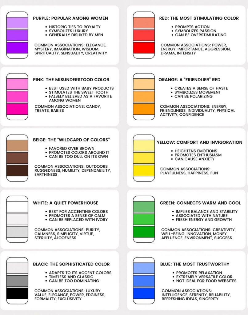
Each color conjures a different feeling and emotion. For this reason, it is important to consider the impact of color when designing your website or brand.
Warm Colors
In general, warm colors remind us of sun or fire. These colors are energizing, passionate, and reflect energy and enthusiasm.
Red: It should not be a surprise that red is associated with fire or danger. The color can also represent excitement, passion, and power. The truest of reds can be overwhelming when used as the foundational color for design. Red is best reserved for a dramatic accent color.
Orange: Similar to the changing of the leaves in fall, orange denotes movement and even creativity. The color orange reminds us of the fruit by the same name and therefore can be used to represent health and vitality. Orange is strong without being as overbearing as red.
Yellow: Channeling the warm of a sunny day, yellow represents happiness, light, and sunshine. Including yellow in your designs adds a bit of cheerfulness.
- Learn about our SEO services
Cool Colors
Cool colors remind us of refreshing water or serene relaxing feeling of grass between our toes. These colors tend to be more soothing and relaxed than warm colors. The inclusion of cool colors in your website can add a touch of professionalism.
Green: Combing the warm of yellow and coolness of blue, green provides stability and balance in design. This harmonizing color is often used for websites relating to nature or wealth.
Blue: Blue signifies calmness or responsibility, but the exact meaning can vary based on the shade. Dark navy blue is popular with corporate designs to represent strength. By contrast, light blues evoke calm and relaxation.
Purple: For centuries, deep purple has represented luxury and wealth. Inclusion of light purples, such as lilac, in your design adds a bit of romance.
Neutrals
Utilize neutrals in your website design to set the backdrop. From formal powerful black, to clean white, to wholesome brown, neutrals help to balance out your focal colors.
Selecting a Color Palette
Be deliberate when selecting colors for your website or logo. What impression do you want to send to your target audience? Use the psychology of color to select your primary website colors.
If you need help selecting coordinating colors and shades, use the Coolors color scheme generator.
Combine the science of the mind with the art of color to design your perfect website.


